Soon we will be introducing a revolutionized and streamlined navigation experience!
Say goodbye to clutter and duplication and immerse yourself in a cleaner, more unified page experience.
Depending on your User role and Platform setup you may not see some of the below sections.
Why are we making these changes?
Our platform has seen incredible growth, and while its design has served its purpose since its inception, it's time for an evolution that aligns with our expanding product portfolio. Navigating and fitting the growing array of features has become challenging, so we're reshaping things to make them more intuitive and spacious. And hey, even though you find our platform easy and simple to use, we believe we can sprinkle a bit more awesomeness into the mix!
Guided Walkthrough
Want to see the new navigation in action? Check out this tutorial on the new experience! For a better experience, we encourage clicking on the “View Full Screen” link!
What are the changes?
The most prominent changes can be grouped in 3 key groups.
1. Redesigning the Single Location View
This is the page on which you can see and update your Location's Profile, observe the Directories network, and engage with the rest of the products depending on what's included in your package.
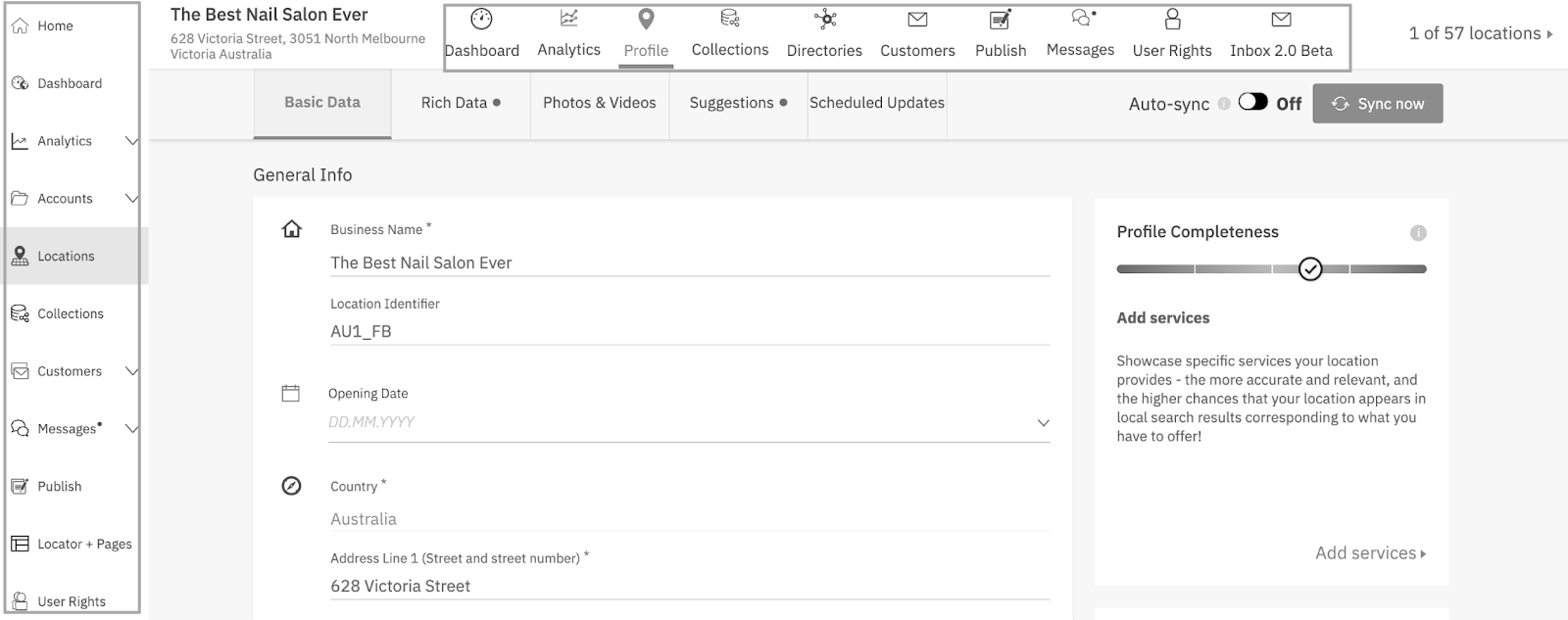
Previously, the single-location view contained many horizontal tabs allowing you to see the data for that location only – automatically filtering in the relevant Posts, Reviews, and others.
Although convenient, this created a lot of item duplication and clutter, sometimes causing confusion – the horizontal top bar contained the same icons and sections as the vertical (side) navigation.
We’ve addressed this by removing the unnecessary duplicate items. From now on, every product will have its own filtering within its dedicated page. This way you to achieve not only the same single-location filtering, but way more with the powerful built-in filters.
BEFORE
AFTER
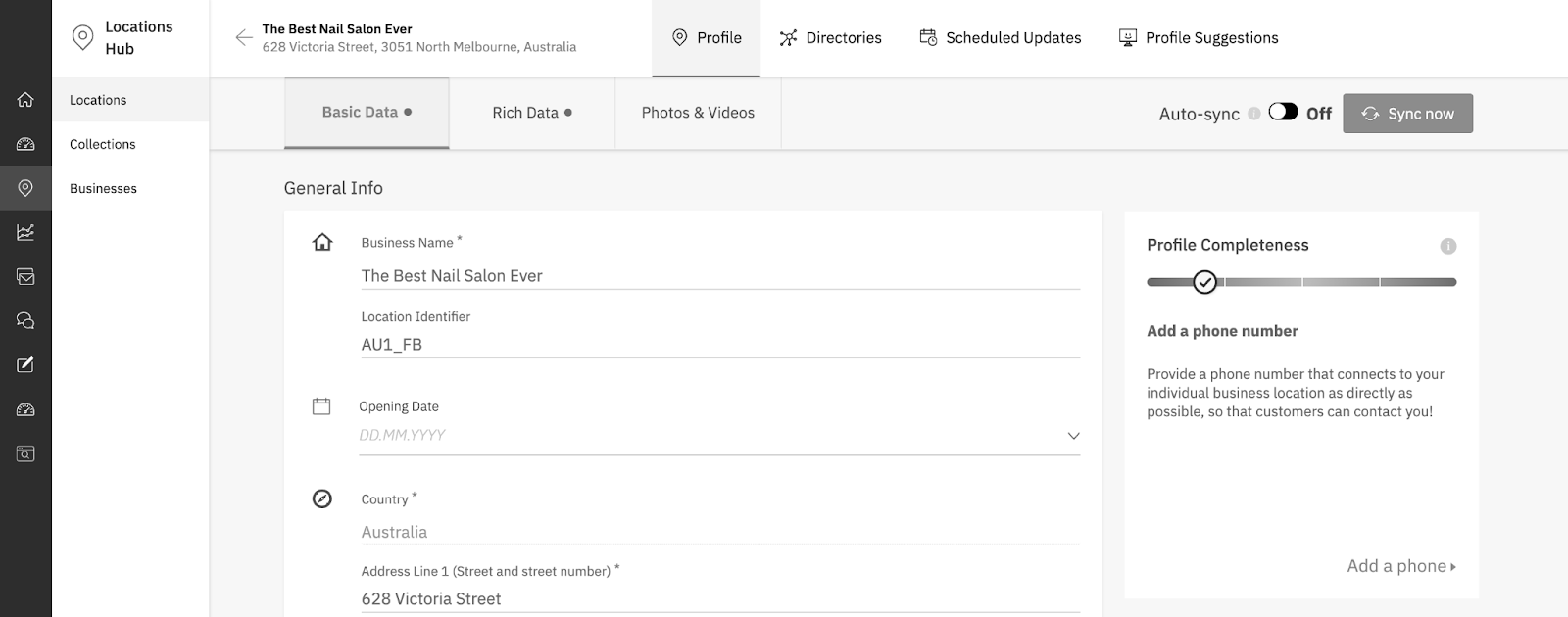
Single location view
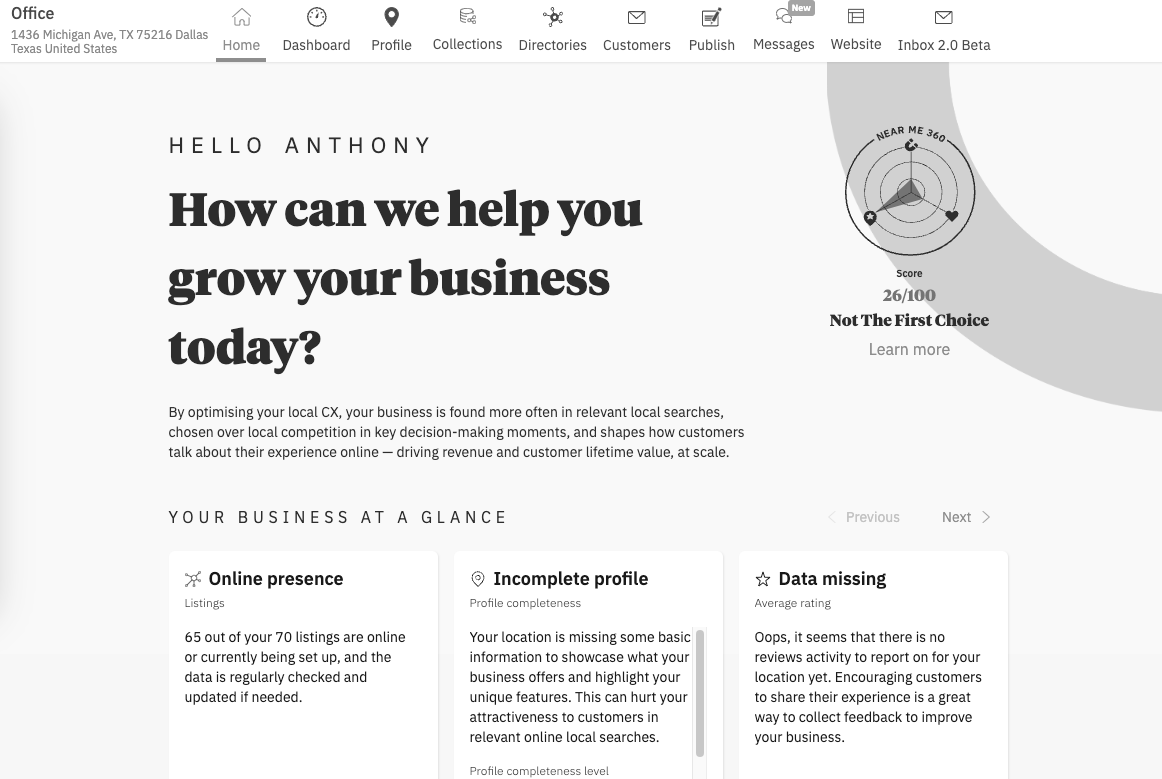
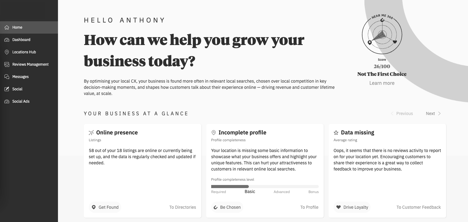
As a result of this change, if you're managing only a single location, you will see things differently, too – the products that you had active at the top, are now placed on the side.
BEFORE
AFTER
2. Product Renamings
We have changed the names of some Products and Product Lines to better capture their nature within our platform and the broader ecosystem.
Locations tab renamed to Locations Hub
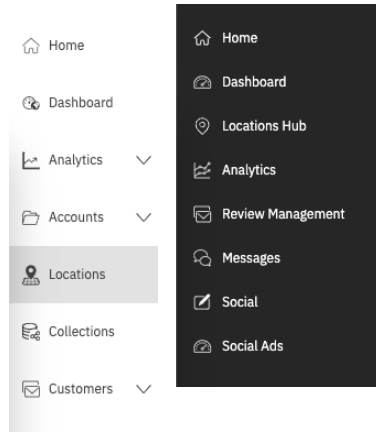
Customers tab renamed to Reviews Management
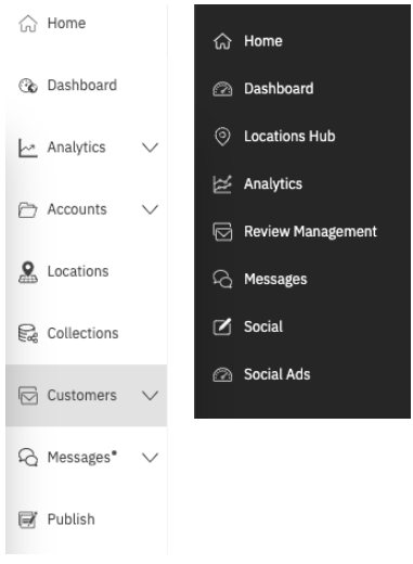
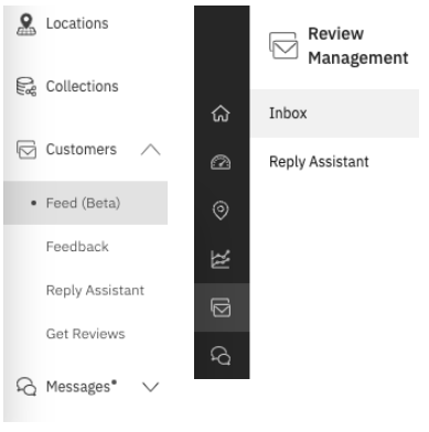
Feed (Beta) tab renamed to Inbox
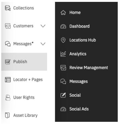
Publish tab renamed to Social
- Posts & Templates tab renamed to Social Posts
- Template Library renamed to Social Templates
Contact & Support renamed to Help & Support
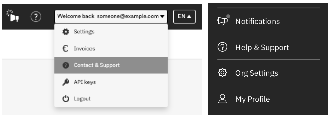
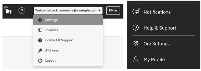
Settings renamed to Org Settings
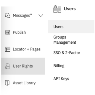
User Rights renamed to Users
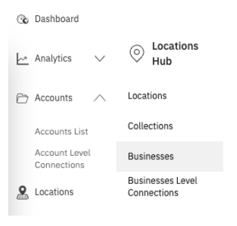
Accounts to be renamed to Businesses
We’re taking this opportunity to align the “Business” vs “Account” terms in our platform. So these two have been used interchangeably.
To avoid this confusion going forward we will replace all “Account” mentions with “Business”:
- Accounts List to be renamed to Businesses
- Account Level Connection to be renamed to Business Level Connections
- Account Managers to be renamed to Business Managers
- … and so on
Asset Library to be renamed to Asset Management
3. Product Regroupings
Similarly to the previous renamings, some of our products have been moved into new places
Locations Hub (previously Locations) now contains
- Asset Management (previously Asset Library)
- Businesses (previously Accounts) and the corresponding sub-pages
- Collections
Settings have been split into Org settings and My Profile
- Org Settings to contain only company-wide settings, such as Users, Groups, Single-sign-on settings, Webhooks, and API keys.
- My profile contains personal information and settings, such as personal details and notification settings, platform interface language switcher, and logout