What is Advanced Analytics?
Table of Contents
What is Advanced Analytics?
Advanced Analytics is a powerful tool that enables you to easily visualise and get a deeper understanding of your data with the use of rich, interactive and highly configurable dashboards.
The tool is intuitive and easy-to-use. The following guide lists out all the options that are available to you with this tool.
The following dashboards are included:
- Listings
- Customer Feedback
- Publish
- Locator+Pages
The dashboards contain controls, KPIs and interactive charts.
Controls
When you click on the 'Controls' menu on the top of each dashboard, you will see the following options:

- Account: filter by account name
- Label: filter by labels
- City: filter by city
- ZIP/Postcode: filter by zip/postcode
- Location: filter by location name. By default the location identifier is displayed here.
- Start and End Date: to select a time frame.
KPIs
The KPIs are displayed above the charts.

They contain:
- Aggregated values for the different metrics displayed in the charts below.
- Year-on-Year evolution percentage of a given metric (i.e. if your selected timeframe is Q2 2020, the percentages will provide you with evolutions vs. Q2 2019).
Interactive Charts
There are 4 types of charts displayed in Advanced Analytics:
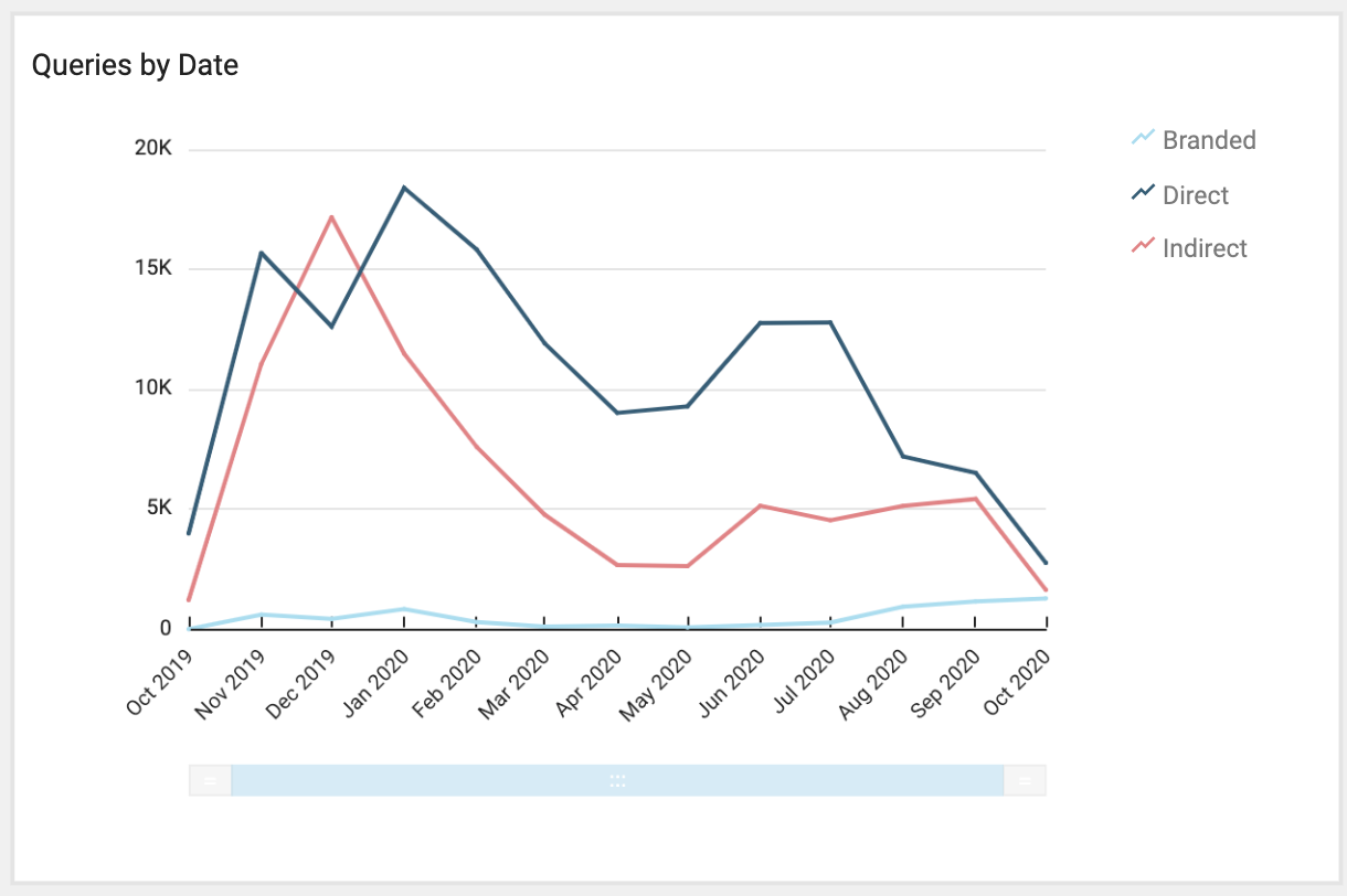
- Line charts: mainly used to represent evolution of the data over time.
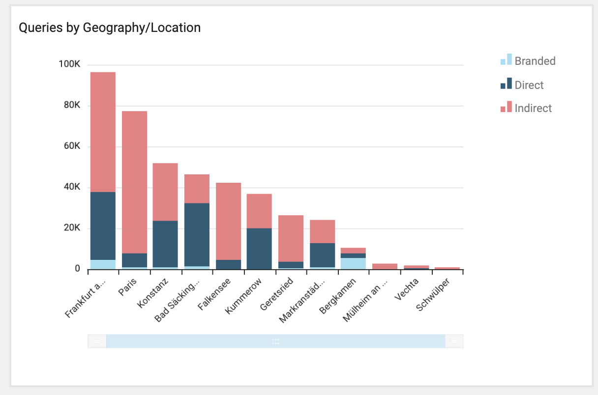
- Bar charts: mainly used to provide geographical analysis.
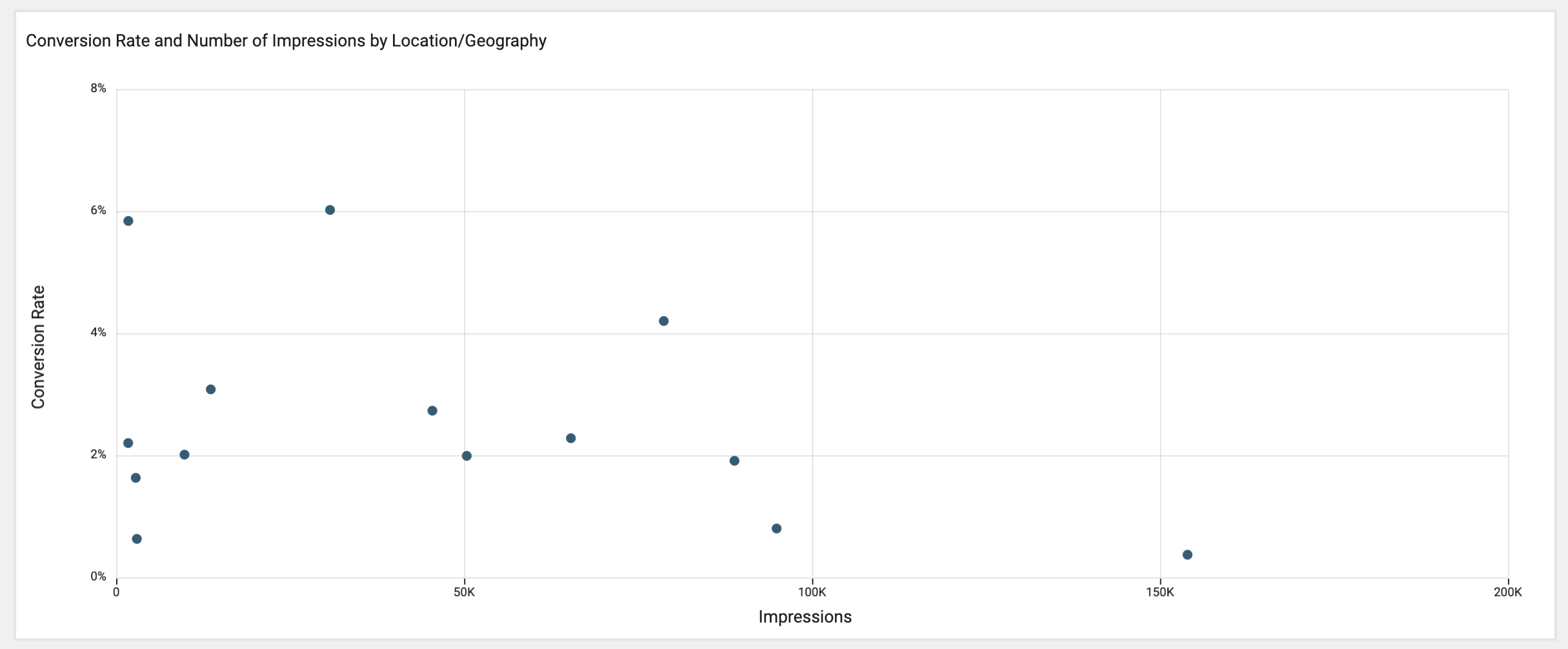
- Scatter plots: to represent relationships between different types of data.
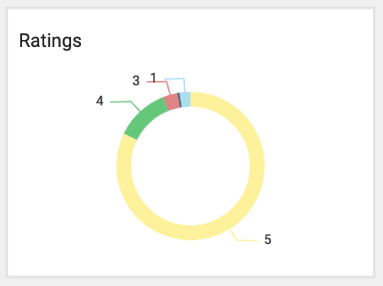
- Donut charts: to represent breakdowns by type of data.
Clicking anywhere in a chart enables configuration options depending on the type of chart:
-
Chart menu (top-right corner):

- Collapse/Expand the menu.
- Maximize: makes the current chart full-screen.
-
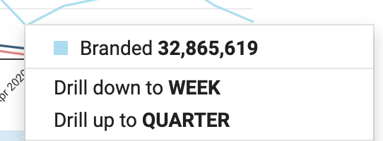
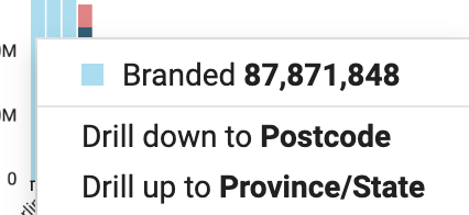
Drill down-up: arrows to switch between different dimensions depending on the type of chart.
- By Date charts: dimensions available from the top to the bottom are Year, Quarter, Month, Week and Day. Month is selected by default.
-
By Geography/Location charts: dimensions available from the top to the bottom are Country, Province/state, City, ZIP/Postcode and Location. By default, City is selected as value in bar charts and location in scatter plots. At location level:
- Location identifier is displayed by default. It is also possible to define a custom identifier for each location to be used in Analytics.
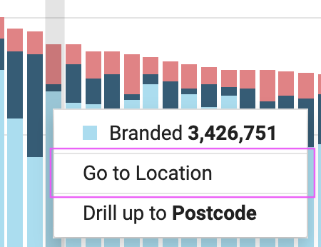
- When clicking in a bar, it is possible to go directly to the location profile of that specific location by clicking in 'Go to Location'.
- Export to CSV: exports the data displayed in the current chart to a .csv file.
-
Scrub bar: at the bottom of some charts there is a clickable bar that allows you to reduce or increase the data that is displayed and scroll through the data (click and hold the scrub bar and slide it toward the end that you want to see).

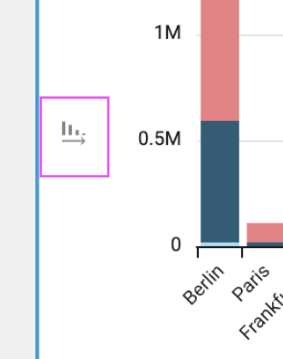
- Sort by: appears inside bar charts at the left side of the Y-axis. It allows you to switch between descending and ascending sorting. The data is displayed in descending order by default.
Clicking in any datapoint inside the graphs displays a tooltip where it is possible to drill down/up to a specific date or geography/location.
Below we will explain in detail the different charts available in each dashboard.
Listings
Contains data for locations/accounts status, connect rates on Facebook and Google and Profile Completeness per field.
- Location status: breakdown of all locations by status Active, Inactive, Closed and Cancelled
- Accounts: number of active accounts
- Google My Business: number of Google listings connected
- Facebook: number of Facebook listings connected
- Profile Completeness: displays the percentage of locations that have completed the various location data fields.
Contains 3 tabs:
- Awareness: showing different types of Queries (Direct, Indirect and Branded) and Impressions (Maps and Search).
- Interactions: showing different types of Clicks (Directions, Phone and Website).
- Conversion: with a ratio of clicks to impressions.
Awareness
- KPIs: displays the total queries and year-on-year evolution.
- Queries by Date: displays the evolution over time of the different query types.
- Impressions by Date: displays the evolution over time of the different impression types.
- Queries by Geography/Location: this chart provides a geographical analysis of the queries by type.
- Impressions by Geography/Location: this chart provides a geographical analysis of the impressions by type.
Interactions
- KPIs: displays the total clicks for different types and year-on-year evolution.
- Clicks by Date: displays the evolution over time of the different click types.
- Clicks by Geography/Location: provides a geographical analysis of the queries by type.
- Phone Calls by Hour: this chart provides the distribution of phone clicks by hour.
Conversion
-
Conversion Rate and Number of Impressions by Location/Geography: scatter plot that visualises the conversion rate (Y-axis) vs. total number of impressions (X-axis). Conversion is calculated dividing the total number of clicks (directions, phone and website) by the total number of impressions.
TIP: Outliers can be filtered out via controls so the graph zooms in on the remaining data.
Contains data for Facebook impressions and clicks.
- KPIs: display the total impressions/clicks and year-on-year evolution.
- Impressions by Date: displays the evolution of impressions over time.
- Clicks by Date: displays the evolution of clicks over time.
- Impressions by Geography/Location: provides a geographical analysis of the impressions.
- Clicks by Geography/Location: provides a geographical analysis of the clicks.
Customer Feedback
Contains 2 tabs:
- Inbox: provides an overview of the received feedback.
- Ratings: provides a scatter plot with detailed analysis of the ratings received.
Inbox:
-
KPIs:
- Total Reviews: total number of reviews (with and without text)
- Average Rating: average rating of reviews
- Average Reply Rate: average reply rate for the total reviews.
- Ratings: breakdown of ratings by star
- Reply Rate by Rating: breakdown of the average reply rate by rating
- Feedback by Date: evolution over time of the different feedback types (reviews, photos and Q&As).
- Reply Rate by Date: evolution of the reply rate over time. A reply rate in a given date gives the rate of replied reviews that were received in that date, no matter when the reply was done.
- Ratings by Date: provides a chronological analysis of the ratings received. It combines a breakdown of the ratings (bar charts, left Y-axis) with the evolution of the overall average rating (line chart, right Y-axis).
- Ratings by Geography/Location: provides a geographical analysis of the ratings received. It combines a breakdown of the ratings (bar charts, left Y-axis) with the average rating (line chart, right Y-axis).
Ratings:
- Average Rating and Number of Ratings by Location/Geography: scatter plot that provides a detailed analysis on ratings received. The Y-axis represents the average rating and the X-axis the number of ratings received. Outliers can be filtered out via controls so the graph zooms in on the remaining data.
Publish
Contains data for post views and clicks for Google and Facebook.
- KPIs: display the total post views and clicks for Google and Facebook
- Post Views by Date: displays the evolution of post views over time for Google and Facebook
- Post Clicks by Date: displays the evolution of post clicks over time for Google and Facebook.
- Post Views by Geography/Location: provides a geographical analysis of the post views for Google and Facebook.
- Post Clicks by Geography/Location: provides a geographical analysis of the post clicks for Google and Facebook.
Locator+Pages
Contains data for local page impressions and clicks in locator+pages (directions, phone, CTA, content and social post).
- KPIs: display the total local page impressions and clicks by type in locator+pages.
- Local Page Impressions by Date: this chart displays the evolution of local page impressions over time.
- Clicks by Date: this chart displays the evolution of clicks by type over time in locator+pages.
- Local Page Impressions by Geography/Location: this chart provides a geographical analysis of the local page impressions.
- Clicks by Geography/Location: this chart provides a geographical analysis of the clicks by type in locator+pages.
Resources
In the following, you will find different kinds of resources with best practices or tips on how to use Advanced Analytics.
Webinars:
How Advanced Analytics helps you to measure and boost your global and local success (available in English, German, French)
This webinar is about how to take full control of your marketing efforts on a global and local scale with Advanced Analytics.
We share insights and best practices on how big brands measure the impact of your local marketing strategy while boosting your performance in specific regions or locations.
Your key takeaways:
- How Advanced Analytics can empower you to make data-driven decisions from a global to a local level.
- How you can boost your performance in specific locations or regions.
- How Advanced Analytics works in combination with other products.
For the English webinar, click here.
For the German webinar, click here.
For the French webinar, click here.
Blog:
Leveraging Analytics: How Data Can Take Your Location Marketing to the Next Level
This blog post focuses on the big questions:
- Why do local analytics matter?
- How can analytics help me attract customers?
- What can metrics tell me?
- And which metrics should you focus on?
If you are curious to find out about the answers to these questions, follow these links:
For the English blog post, click here.
For the German blog post, click here.
For the French blog post, click here.
Success Story TUI:
TUI Taps Into Metrics that Matter with Advanced Analytics
The UK’s leading travel brand, TUI has used the platform since 2018 to bring more than 6 million UK holidaymakers a memorable ‘Near Me’ Brand Experience at more than 600 agencies across the nation.
Having so many different locations, it became challenging to have a clear overview of the online presence and performance of each standalone location in real-time. Read the success story to find out how TUI has solved the problem with Advanced Analytics.
For the English success story, click here.
For the French success story, click here.
Success Story SGS:
SGS Finds a Data Treasure Trove with Advanced Analytics
SGS is the world's leading provider of various inspection, monitoring and testing services with a focus on vehicle inspection and theoretical driving tests.
The success story talks about how SGS determines with the help of Advanced Analytics how local digital marketing strategy influences business success. It also identifies precisely those regions or locations whose performance is below the key figures in overall comparison.
To read the English success story, click here.
To read the German success story. click here.
To read the French success story, click here.
Video:
Most Frequently Asked Questions
We collected the most frequently asked questions by users about Advanced Analytics and turned them into a video. Ehab Aboud, Solution Engineer at Uberall, answers the questions and throws in a few helpful tips and best practices.
Questions we answer are:
- How can we analyse the impact of an offline campaign in a certain region with Advanced Analytics?
- What marketing campaigns or activities can be linked to regional/location-based data in terms of demand and actual interactions/conversions (direction, website or call)?
- Is it possible that different users have different viewing rights in Advanced Analytics?
- What is the use of the previous dashboard once we have Advanced Analytics?